Azore’s New Color Maps: Representing Data for Those with Color Vision Deficiencies
By Kelly Hile
Azore’s newest release, Azore 2022R1, features a wider selection of color maps. The expanded color map library is designed to give users more control over how their data is visualized.
Whenever scientific analysis involves complex or large amounts of data, communicating visually can significantly help an audience understand the results. The right visual display can help decision-makers reach conclusions about complex data more easily, such as when a community should evacuate for severe weather (below). The visualization of complex data is almost always a goal of Computational Fluid Dynamics (CFD), where multiple fields of data (e.g. temperature, velocity, pressure) are calculated over a 3D volume or surface. This data is usually displayed using color mapping.
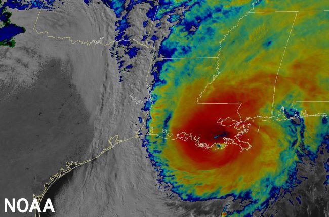
NOAA satellite imagery of Hurricane Zeta
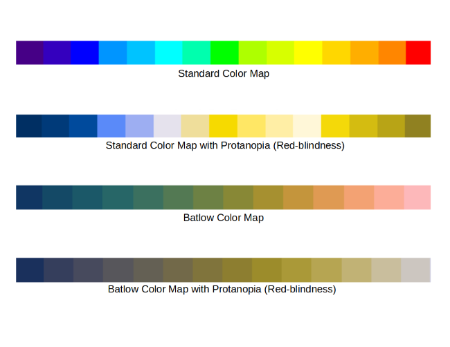
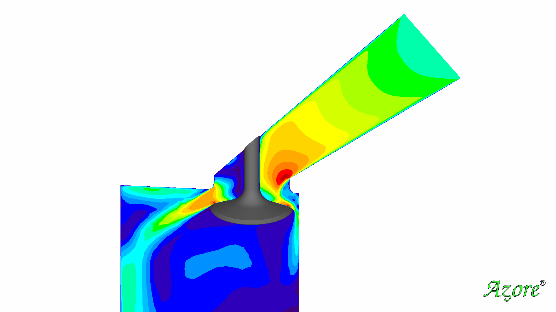
A color map is a set of colors that correspond to numerical values. One of the most common color maps used for data display is the Jet map, which utilizes the colors of the rainbow. These colors and their apparent order are widely known, making it easy for most people to interpret. The example below shows CFD simulation results for the flow around an engine intake valve.
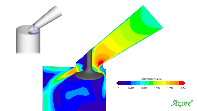
Flow around an engine intake valve with standard color map
Scientists who analyze and display data are becoming increasingly aware of how to make data displays more accessible for those with visual deficiencies. Worldwide, 1 in 8 men and 1 in 200 women have some form of color vision deficiency and will have difficulty interpreting a traditional color map. When someone with red color blindness (protanopia) views the rainbow map, similar colors recur for multiple number values.
A standard rainbow map as viewed with protanopia (red-blindness)
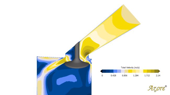
Azore’s newest release, 2022R1, includes additional color maps that are specifically designed to be accessible to those who cannot distinguish the complete color spectrum. One of these color maps is Batlow, where each incremental color varies equally in brightness and hue, making color variations visible for those with all types of color deficiencies, even in complete grayscale.
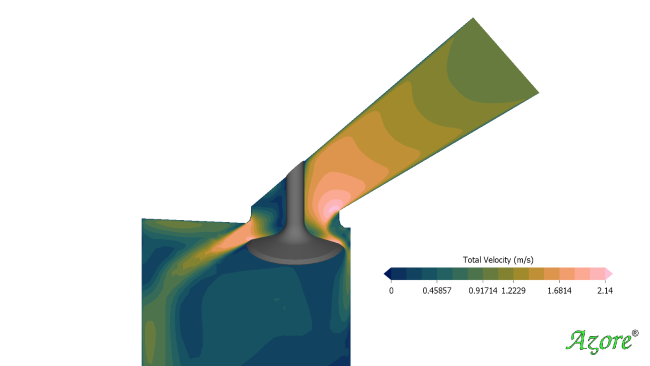
CFD results shown with Batlow color map
When Batlow is viewed by someone with visual color deficiencies (below), none of the colors are repeated and the color scale remains intuitive and incremental.
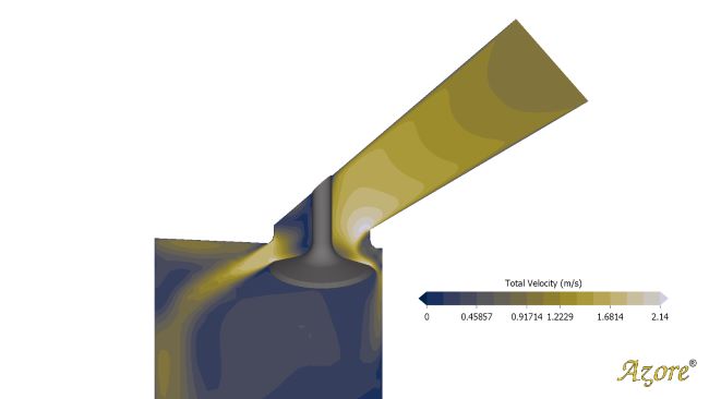
Batlow color map as viewed with protanopia
Batlow is one of many newly available color maps in Azore. The increased library will make it easier for users to customize their visual data representation. With Azore’s intuitive user interface, you can easily change from one color map to another, customize color maps, or import your own. Simply click the Color Map button to make adjustments or navigate to the Display Options menu and choose Color Map Selection.
Azore’s latest release includes a host of new features. Azore 2022R1 now offers transient solutions and the ability to view and interact with emerging solution data while the solver is running.
Learn more about Azore's latest release: Azore CFD Takes the Stage With Its New Release